Understanding Color

Basic Color Wheel
First things first – let's answer the question “why is standardizing color important?”
Have you ever ordered a print from a photo lab (metal or not) and what you got back didn’t match at all what was on your screen at home? Did you blame the lab for printing your image incorrectly? Or did you step back and go through all of the variables to ensure everything was in line prior to submitting your file? Let's go through some of these variables together.
The subject of your photo is unique to you. The settings you set on your camera and the way you stage your photo are all unique to you. Photography is full of subjective variables that allow you to create whatever you can imagine. However, the one truly quantifiable, measurable, and most variable part of this entire process is color. You can prove color to someone using numbers. There should be no debate. Even though color is measurable, it does not make it any less subjective.
So let’s start at the very beginning.
Step 1. Your Camera
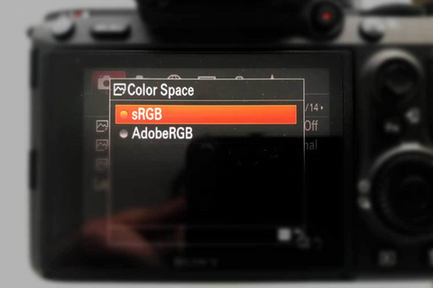
When you first pick up a DSLR and you begin learning about what all of the settings do, everyone typically follows a very similar structure when it comes to learning about their camera and photography. You learn about Aperture, ISO, Shutter-speed, as well as image format (check our our jpg vs raw article). There are plenty of videos on YouTube explaining what each of these mean/do, but we want to focus on an area that many people skip over: The Color-Space.
There are typically two choices for color space, sRGB and Adobe RGB. sRGB is what most PC’s and monitors/devices can display. sRGB doesn’t cover some of the more vibrant and saturated shades that are possible with the camera and reproducible by your printer. That brings us to Adobe RGB. It is big enough to hold colors that would be “clipped” in sRGB space. In this context clipped means unable to show the colors, so it “cuts them” or “doesn’t display them.” Adobe RGB color space allows you to capture and reproduce more vibrant and saturated colors.
So What On Earth Actually IS A Color-Space?

Common Color Space DSRL Menu
To put it simply, the color-space represents a spectrum (plane) of color. It acts as a set of instructions for your camera that explains to it exactly what these RGB (Red, Green Blue) values mean. It tells you what colors your are able to capture and reproduce, and which you cannot (more on the “cannot” part later). So if the Color-Space represents the entire plane (as seen below) then the actual reproducible area is refereed to as the “Gamut.”
Quick Note: The sRGB/Adobe RGB selection on your camera applies to JPEG images only. If you are shooting in RAW format, this allows you to capture the full gamut that your camera is physically capable of capturing.
Another quick note: We accept both 8-bit and 16-bit files at IW. The main difference between an 8 bit image and a 16 bit image is the amount of tones available for a given color. If you want more info on what these mean Print Aura did an excellent article on this. Check it out by clicking here.
If you need help sizing your image correctly in order to ensure you are getting the most out of your camera in terms of details retained in the final print, check out our scaling article HERE.

Various Colorspaces & Gamuts
Internally here at Vivid Metal Prints we use Adobe RGB (1998). As you can see above, the Adobe RGB color-space has a much wider color gamut than sRGB, but a smaller gamut than ProPhoto. There are other color-spaces out there. However, whatever color-space you upload, we must change it to Adobe RGB prior to starting. We will get more into the “why” we convert prior to starting further down (see the section on “Gamut Warning” below).
So now that you have taken your photo, it is time to look at it on screen. But wait, is your monitor calibrated?
Step 2. Your Monitor
How can we be sure that the blue you are looking at on your screen is accurate? How can we be sure that once we get it we see the same blue you do?

Monitor being calibrated
There are many tools out there that will allow you to calibrate. We do it for free to local customers that want to drop by. If you have never calibrated your monitor we strongly recommend you reach out to a local photo-lab. They may offer to do it for you for free or an affordable price. This is something extremely critical to do. This type of calibration will check your brightness as well as your color reproduction. It takes approximately 30 minutes and it will flash various colors of the spectrum and tweak them in order to dial them into appropriate color standards that most printers should go by.
It is important to note a few things here however:
- This is still not a 100% guarantee that we are looking at the same thing due to differing screen technologies. For example, an LG screen vs a Samsung or Dell screen can vary how they display certain colors. So while the digital RGB number value read may be the same, visually they could still be different.
- Simply calibrating your monitor is not enough. It is one of several layers that all have to be in line with each other to be effective. We will go into each of the other layers below, but just keep in mind that none of these components alone are enough. You have to go all in if you want to ensure accuracy.
- Monitors are backlit. While our metal prints come close to looking like something that is backlit, it is still not the same. So there are some colors (predominantly neon colors) that are just not possible to be replicated in any print medium.
So at this point we have established a color-space/gamut, and we have calibrated our monitor. What’s next?
Gamut Warning
So how do we see if our photos elements are within tolerance of the gamut that we are working in?
Let’s open this photo in Photoshop:

Test Image
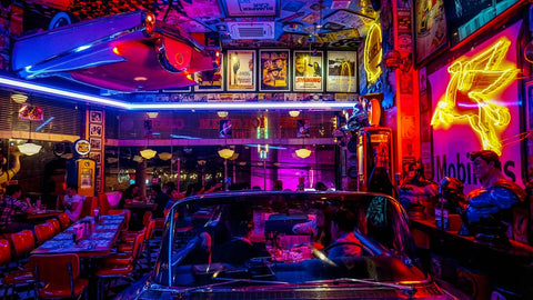
As a printer, I can already tell that much of this photo will be “out of gamut” simply because I have seen many of these types of neon photos that have colors outside of the “realistic” spectrum. These colors are difficult to reproduce without back-lighting.
So the way we check is this:
First lets make sure we are in the Adobe RGB Color Space:
Across the top of your page, click on EDIT and then click on COLOR SETTINGS. This will allow you to select your color-space in Adobe Photoshop:

Assigning a color-space
Then, with the image open within our software across the top of the page you click VIEW and then GAMUT WARNING.

Checking gamut warning in Photoshop
In Lightroom it is a bit different: With the file open and within the “Develop” tab, click on VIEW and then SOFT PROOFING and then MONITOR GAMUT WARNING.
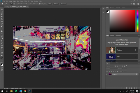
What you will see is something like this:

Checking gamut warning in Photoshop
So as you can see, Photoshop has shown us which colors are out of gamut. Now we really don’t want this to scare you. We can usually get extremely close (most of the time to the point where you can’t even tell unless it’s a NEON color), but this is more just to keep your expectations realistic when it comes to which colors we are actually able to hit. But don’t worry! Your print will still look absolutely stellar! This entire section is simply to discuss and make you aware of the limitations that non-backlit media has.
So now that we have imported the file, looked at it on a calibrated monitor, checked our gamut warning, let's see if our printer produces the same thing.
Step 3. The Printer Profile
A printer profile is like a set of instructions that tweak the colors that your printer is spraying to produce the most color-accurate-to-your-screen physical print you can. We will elaborate more on this further down below. At this point, we are going to make a few assumptions about the imaginary file we are testing together in this example:
- 1. You’ve shot in or converted your photo to the Adobe RGB Color-space.
- 2. You have imported into Photoshop and checked my gamut warning.
- 3. Your screen has been calibrated.
If your screen is calibrated, and your color-space is set, and the gamut warning has not grayed anything out (meaning all colors should be “attainable”), your printout should be accurate right?
Maybe.
There is one final extremely critical piece to the color puzzle: your printer profile.
Last But Certainly Not Least!
The printer profile acts in a very similar way that a color-space acts for your screen – though it has a different function. The end product is the same: more consistent color. However, the process is different. Color-space sets limits for your screen/files, but the printer profile dials in your colors in order to get them to print accurately. If the above factors all stand true, when you print this photo at home without a printer ICC profile what can you expect? Depending on your printer, and depending on whether you have the setting enabled in Photoshop to allow it to manage your printing profile (click here to read an Adobe article on how to do this) it should be pretty close.
Downloading and installing an ICC profile and allowing Photoshop to manage it is fairly easy. We will include another resource at the end to assist with this in the summary.
Internally we use another piece of software that allows us to make very specific “micro” adjustments to our profiles to account for our random process variables.
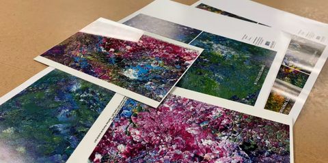
Let's do an easy and fun exercise to check just how close your system is calibrated. So let’s do it! Save this file below by right-clicking it and clicking save, print it on your printer at home, then open the same file on screen and look at them side by side. Are they identical? Are they drastically different? Why is that? How can you get them in line with each other?

Color Test (right click -> save as)
Remember When We Discussed Monitor Calibration Earlier?
When you download an ICC profile from your printer manufacturer, you choose your printer, you choose your media (paper) and the profile will handle the rest. In sublimation we do not have the same luxury. We have to build and manage our own profiles constantly.
The WAY we actually do it is this: you see the colored blocks above? Imagine a 4,000 block panel. Thousands of different little colored blocks get sublimated to a metal piece and then scanned with the same device we used to calibrate our monitor.

Reading color values to fine tune profile
We then import these values into our RIP software (the program we use to run all of our printers). This software then tells us whether or not our colors are all within tolerance. If they are, then we are good to go. If not, we have to make manual adjustments (like pulling back the red if everything is coming out warm, or vice-versa) until all of our L-Values (the actual numeric “score/grade” of how close you are to acceptable in your configuration) are within acceptable tolerance (usually within 1 point).
In order to explain why we have to constantly manage and update our profiles, we want you to better understand the event that causes us to have to do this in the first place. In order to do that, we have to explain these events which we call “phase shifts.”
Typical Phase-ShiftsA phase shift in our context means the change from one state of matter to another ie gas, liquid, solid.

Various states of matter
When you are doing a paper-print on your paper printer, your inks are typically a powder or a liquid. Your printer takes these and sprays them onto paper, turning it into a solid (once it dries). The printer profile tells the printer exactly how much of each ink needs to be sprayed to achieve the desired color (that appears on your screen) on your exact media.
Phase-shifts cause color shifts. Profiles are in place to dial these color-shifts back in.
In regular paper printing, there is this single phase shift. So if your print has colors that are inaccurate, you have to ensure that you have the correct printer profile (often referred to as ICC profile) downloaded and applied. Once applied, it will get you right in line.
This means that if your screen is calibrated, and your printer profile is right, when you print that color-swatch from above and hold it up to the screen they should be identical!
To obtain these ICC profiles, go to the website of your printer manufacturer and downloading them. The Travel Explore Click channel on YouTube did an excellent video about this which you can watch by clicking HERE.
Our Phase-Shifts“Can you send me an ICC profile so I can soft proof at home?” We hear this question a lot.
Our response is typically “we sure could, but it would do you absolutely no good.” You see, much unlike the standard process we actually deal with FOUR separate phase-shifts that we have to fight against – with each phase-shift introducing different color-shifts.
Shift 1. Our ink is in a liquid form. This is sprayed onto a high-release dye-carrier paper. This is managed by our printer profile. It gets us usually about 80% of the way there.
Shift 2. Once in the paper, these dyes turn into a solid as they dry.
Shift 3. We then tape this paper to the aluminum and send it into our heat-press. This uses heat and intense pressure to turn these once liquids (now solids in the paper) into a vapor.
Shift 4. This vapor then gets embedded into the aluminum coating thus completing the sublimation cycle and ending our last phase shift.
10 times out of 10 our print file does not at all resemble the customers uploaded print file. This is why when someone tells us not to do any color correcting we have to explain that it is simply not possible and they would very much dislike the finished product if we did this. Due do all of these variables our process is a bit different than standard.
A quick note: the sublimation process is one of the only ones which leaves residual dyes left over in the paper. So thinking about it in terms of a regular personal paper printer, if you are putting 10 points of cyan into the file, the printer will spray 10 points of cyan. We have to put in 11 points, in order to get down the 10 on the metal with 1 left in the paper. So the science behind setting the proper ink limits on the back end is also a part of the otherwise standard calibration process.
So The Process For Us With Your Files Works As Follows:
- We sublimate a small sample of your untouched image.
- It is held up to the screen to see how close we are with just a printer managed profile. We do this as many times as necessary to get it right.
- Then, we make adjustments in Photoshop to compensate for any color-shifts that we are seeing when comparing the screen to the metal proof. Our ICC profile gets us close but it really takes human fine-tuning in order to get it where it needs to be.

We have to do this because sublimation profiles are extremely unpredictable. Slight changes in humidity or temperature can also cause shifts in color, shifts in necessary sublimation/drying time, & more. So staying calibrated is not a job that ever ends – it only gets improved on.
In Summation:

If your monitor isn’t displaying accurate color, it makes the rest of the process more difficult. Since you are not seeing the same thing we are right off the bat, results may be unexpected. We first and foremost match to the screen. So if you alter your file digitally, how can we be sure these moves you are making will appear the same on your calibrated display?

If you are in a color-space that contains colors outside of our gamut, we will not be able to reproduce the print exactly. Files that are submitted as ProPhoto must be converted to AdobeRGB before we can begin. It helps us create your print when it’s colors are actually attainable to us and our process!

This is arguably the most important and most complex part of the process. There are tons of resources on Google/YouTube if you just type in the [model of your printer] + the phrase “ICC Profile.” These guides help you download, apply, and maintain these profiles. Red River Paper did an excellent guide that is a great starting point. Click here to see it.
“This Is All Too Much For Me. Do I Have Any Other Options?”
Of course you do! Look, we totally get it. This critical-color stuff isn’t for everyone. We try to be flexible in all situations to ensure that everyone is covered. There are several options for you:
- You can just trust us to print your file without really setting any of this stuff up. We won’t send out something we wouldn’t be proud to show.
- You can request a proof shipped to you for $25. What does “proofing” entail? Check out this video for a detailed explanation.
- Have you printed it on your home printer and you love the result? Ship that to us and we can use it as a match print!
- If you have not checked it out, look at our blog about HD+ processing and see if it might be something you want to include in your order! Read more here.

There will be a video on our website and on our YouTube that will accompany this article. Let us know if you enjoy it and if you want us to make more content like this! Thank you so much for reading. Take care!


